< Back to My Work

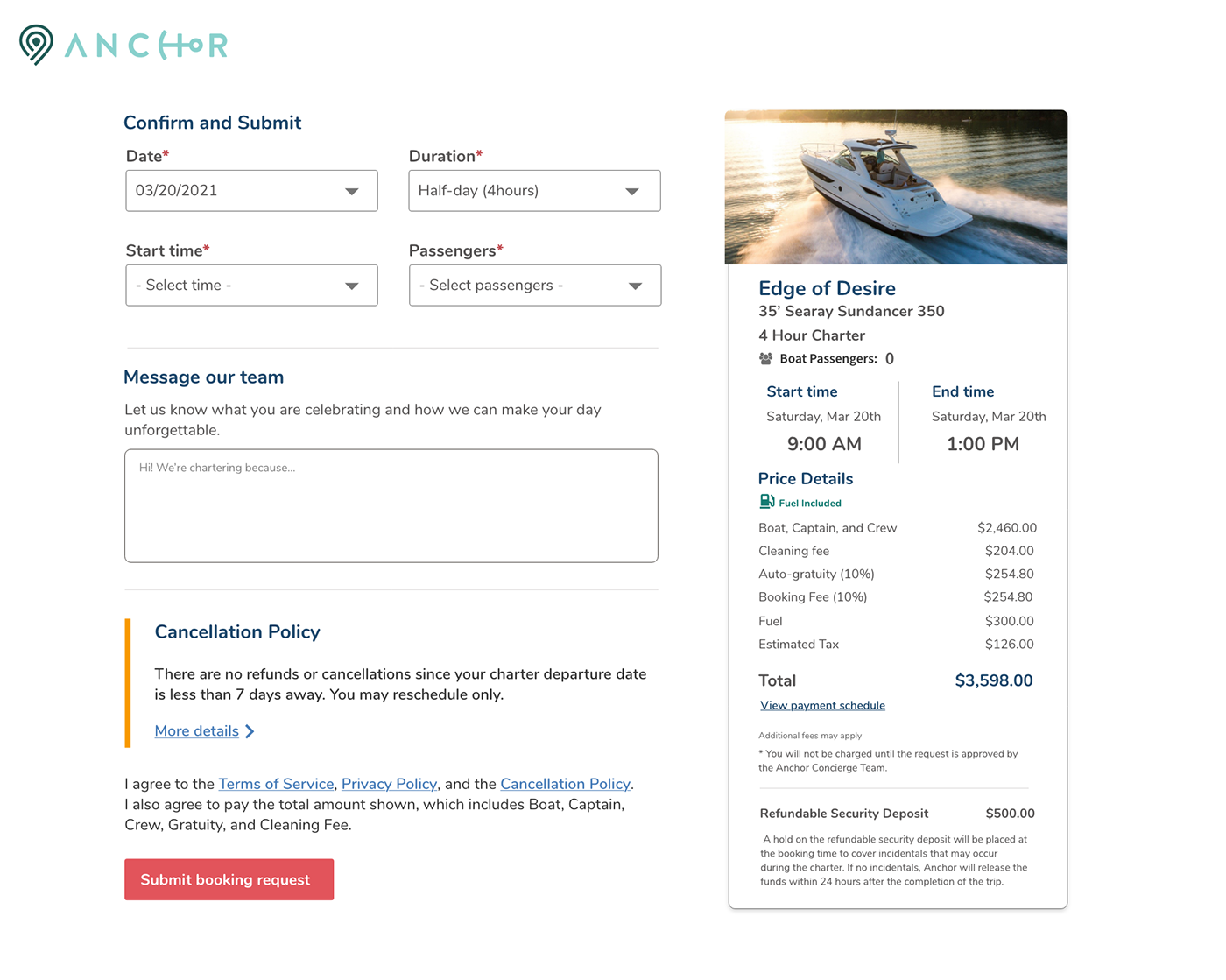
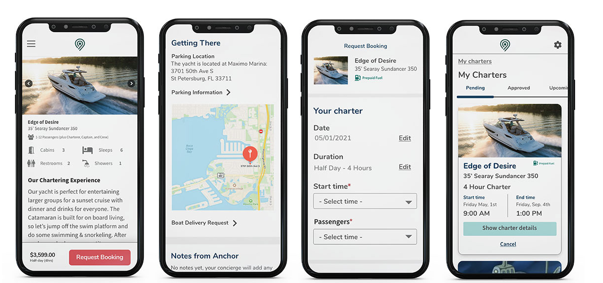
Customer buy Flow and Dashboard

Boat and Yacht​ Charters

Problem: Anchor needed a mobile-friendly customer dashboard and checkout experience that would allow customers to book charters, manage their information, and receive timely updates throughout their journey.

Outcome:  ​Customer buy flow and dashboard with simplified language, transparent pricing, and Twilio SMS notifications integrated throughout the booking journey. Usability improvements were driven directly by findings from remote testing sessions and internal team interviews.
Enhanced client satisfaction by 25%.

My Role: UX Designer, Researcher

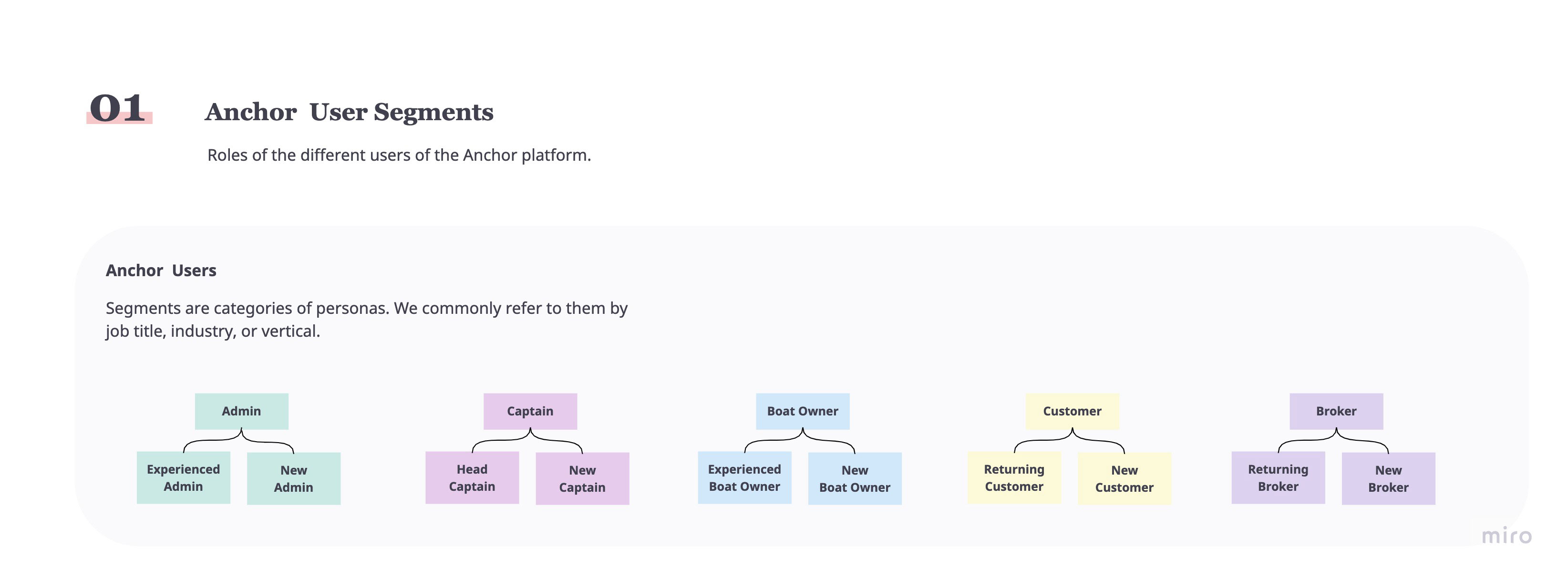
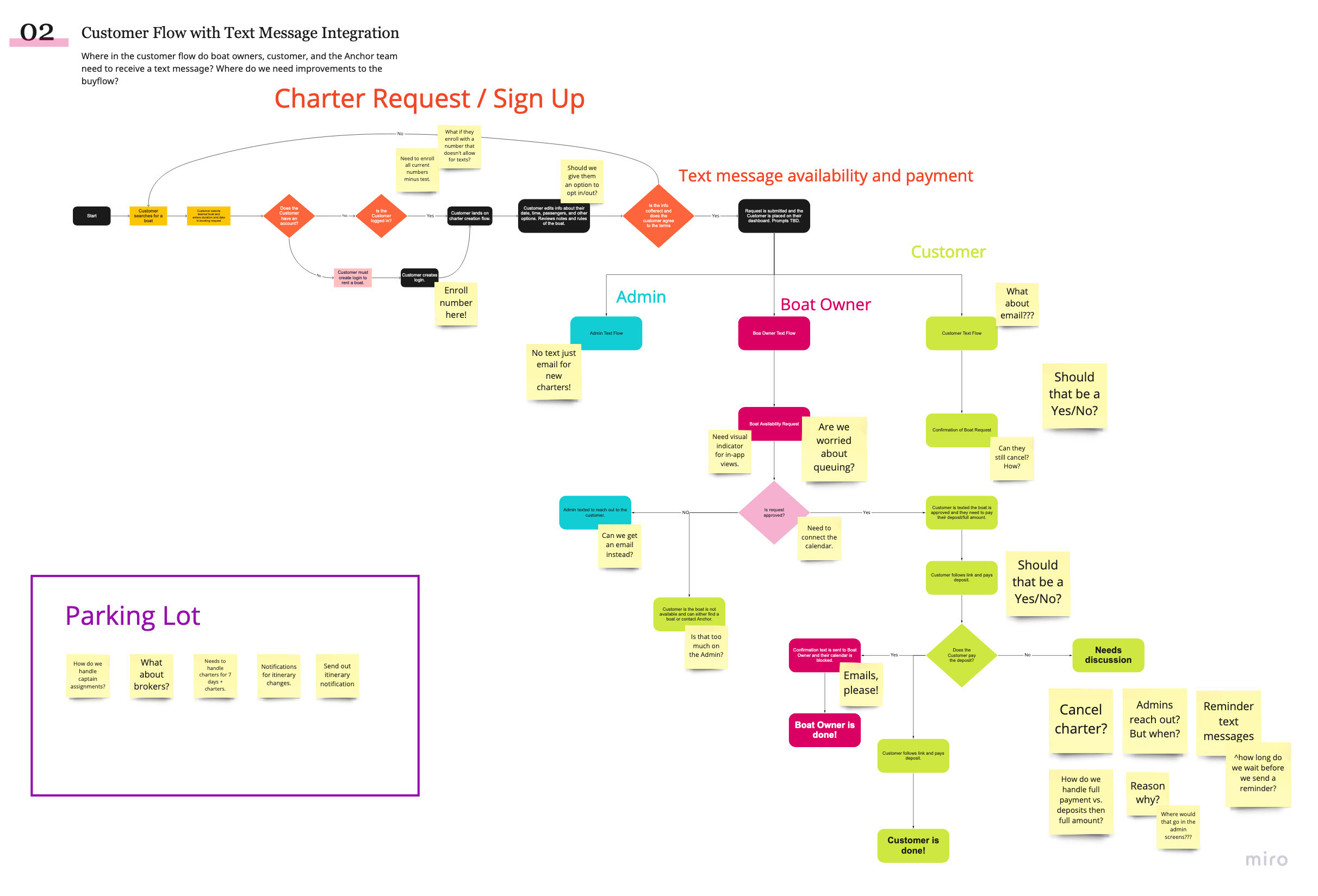
Deliverables: Responsive Visual Design - Customer Segments - User Flow + Text Message Mapping - Usability Testing Prototypes

&quot;&quot;

Mobile Designs

Desktop Designs

Identify User Segments & Check Out Flow Mapping

Alongside the engineering team and stakeholders we identified the following UX artifacts:

  1. User Segments. I created this to help visually identify our users including Customers, Admins, Captains, Boat Owners, and Brokers. Each of these user segments touched some part of the checkout flow. It also helped onboard future employees to the work stream.

  2. Checkout Flow. I mapped the end-to-end customer experience to identify where SMS notifications made the most sense in the journey. We wanted to ensure the messages came through clear and were helpful rather than just creating more noise for people.

1. User Segments

2. Checkout Flow

User Research

To better understand both customer and internal team needs, I conducted a usability study with customers and one-on-one interviews with sales and fleet team reps.These sessions helped uncover key pain points, communication preferences, and information gaps that guided our design decisions and development priorities.

Sales Team Interviews

Goals:

  1. Understand the communication preferences of sales and fleet team reps when working with customers.
  2. Identify what information the sales team needs prior to customer calls.
  3. Capture both structured and open-ended feedback through one-on-one interviews.

Findings:

  1. 100% of reps preferred email and text communication over phone calls as a first point of contact to better manage their time while handling other customers.
  2. Sales reps expressed a need for richer pre-call customer context (e.g., occasion, preferences) to enable up-selling opportunities such as food/beverage vendors or jet ski rental.

Next Steps:

  • Findings were presented to stakeholders and translated into user stories.
  • An MVP of the Customer Buy Flow and Dashboard was scoped and released based on those stories.

Customer Usability Study

Goals:

  1. Test the usability of the Customer Buy Flow. 
  2. Identify pain points customers experience throughout the user journey.
  3. Understand what actions customers take when booking a charter.

Findings:

  • Pricing clarity was a top concern. Customers wanted transparency on charge amounts, timing, and deposit reimbursement policies.
  • Customers wanted price transparency amounts, timing, and deposit reimbursement policies.
  • Lengthy copy was largely skipped or at best skimmed.
  • Post-submission next steps were unclear, revealing a confirmation/feedback gap.

Next Steps:

  • Simplified and shortened the language.
  • Pricing information was made larger.
  • A "How It Works" page would be created in a future sprint.

Final Design

I used the user insights and the experience architecture documents to create the final visual design for an MVP release. ​As a team, we identified several priorities for future iterations. These include implementing a "How It Works" page and refining the post-booking confirmation flow using website data analytics. I also created a plan to continue research initiatives with customers, the sales team, and all company staff.