< Back to My Work

admin dashboard redesign

Odd Couples Housing

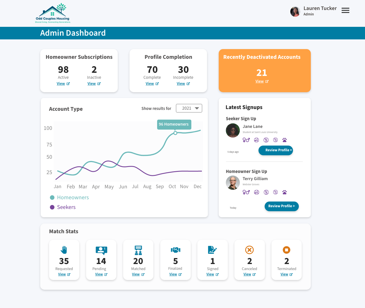
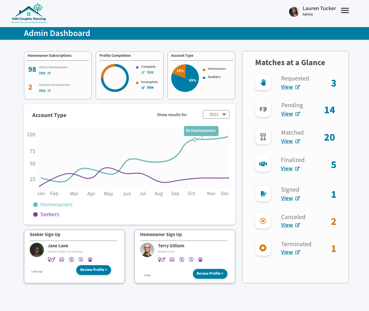
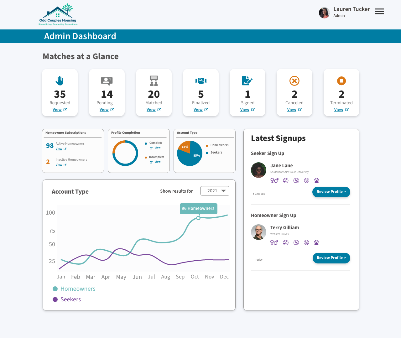
Problem: Odd Couples Housing, a service that matches older and younger adults as roommates, had an admin dashboard that was bare-bones and reduced productivity for the admin recruitment team.

Outcomes:  

  • Improved admin team organization and productivity.
  • Increased mobile accessibility for seamless on-the-go workflows.
  • Delivered an inclusive interface accommodating red/green color blindness while preserving the established brand identity.

My Role: UI Designer, Interaction Designer, Researcher, Visual Branding

Deliverables: High-Fidelity Mock ups - Contextual Inquiry Research Findings - Visual Design & Brand Identity.

&quot;&quot;

Initial Concepts

I ​created three full-color design options with color-blind accessible colors that matched the existing brand colors while giving a better experience for one of our admins who was color blind. The admin team chose the third design. I then facilitated a grooming session to write user stories for the dev sprint. A key tradeoff was made that building MapQuest-style map functionality into the app was too much for this sprint. We put it in the backlog and continued to create a more equitable experience.

Mobile Concepts

User Research Contextual Inquiry

I observed an admin during a typical workday to understand her workflow better.

Specific Study: Day in the Life of an Odd Couples Housing Admin.

Key insights:

Final Product

A mobile friendly dashboard that made it easy for admins to plan and organize their work.